-

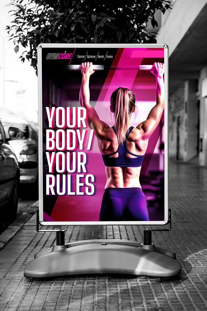
GYMCORE Fitness Club
Task: development of the visual brand identity for a fitness club: logo, branding, and promotional materials.
Goal: to attract people of different ages and genders by presenting fitness as a space for personal growth, strength, and discipline.
Solution: The core communication idea is based on control and self-development. The logo and visual identity are built around the contrast between black and bright neon pink, which adds energy and a modern feel. Diagonal elements and light accents create a sense of movement and intensity. The communication uses images of men and women of different ages during workouts, making the brand more approachable and allowing the audience to relate to it. Bold typography and dynamic compositions create a strong, expressive, and motivating visual language.


-
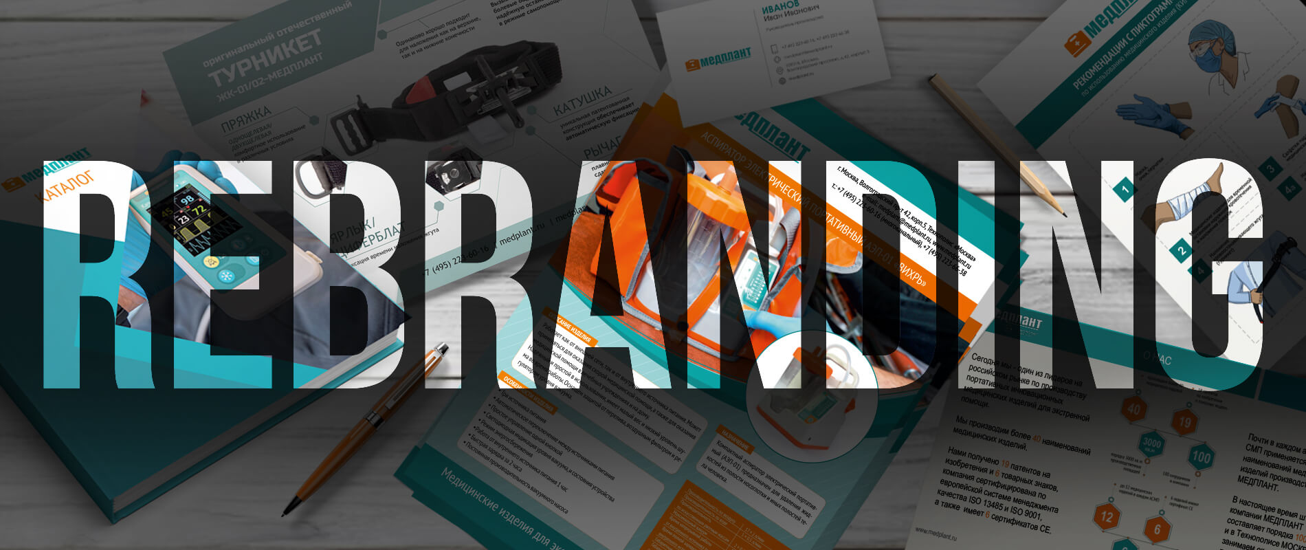
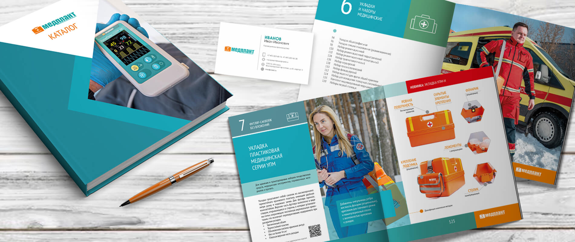
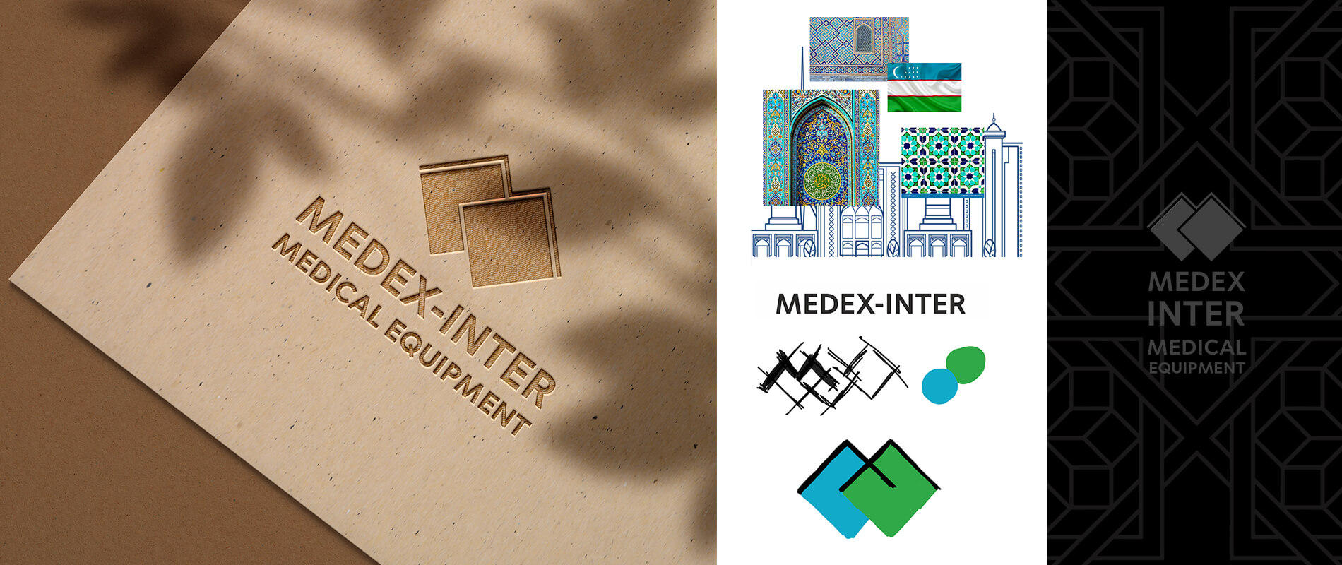
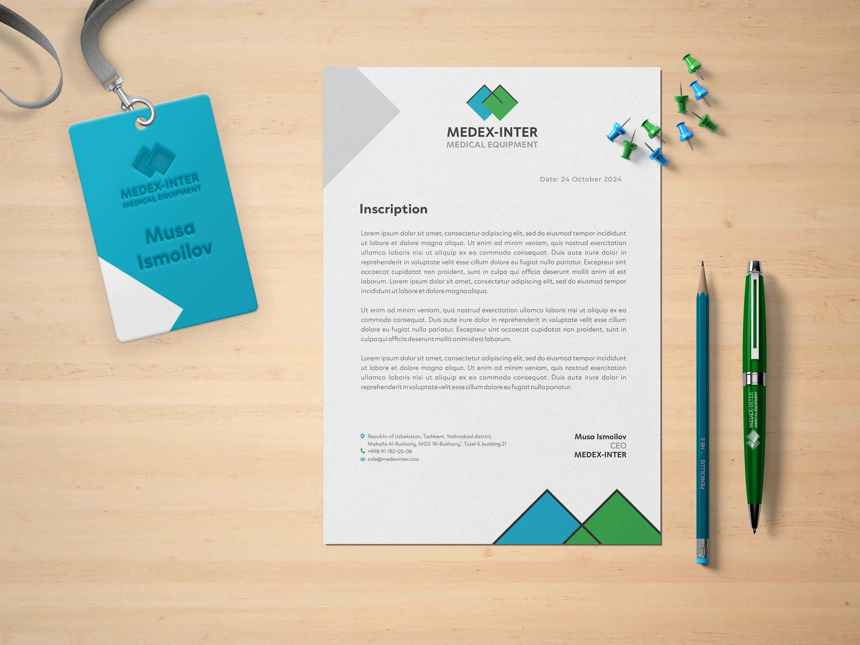
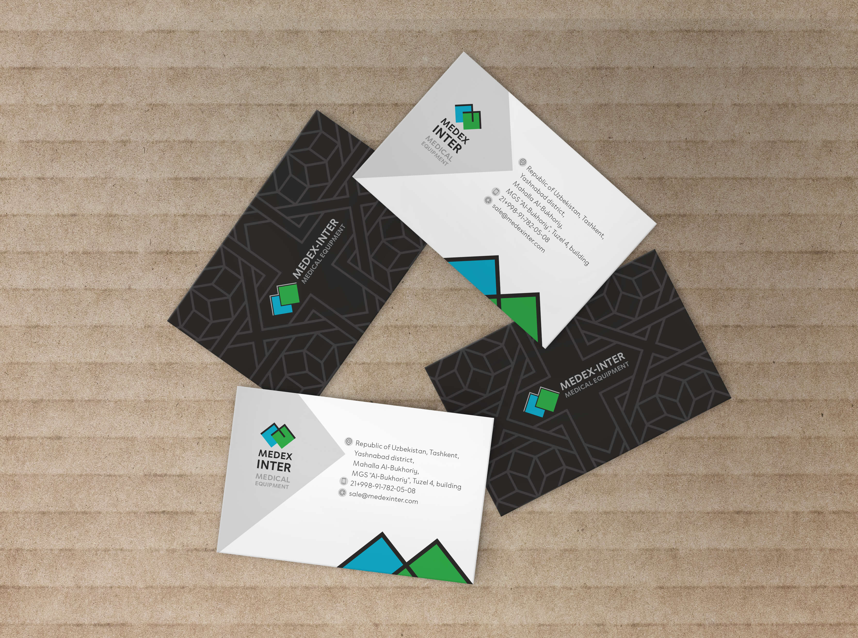
Rebranding MEDPLANT
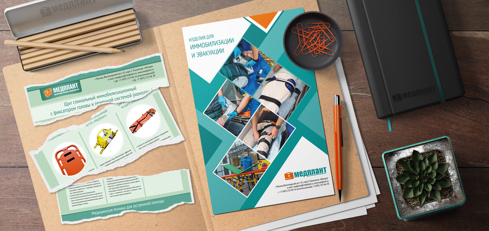
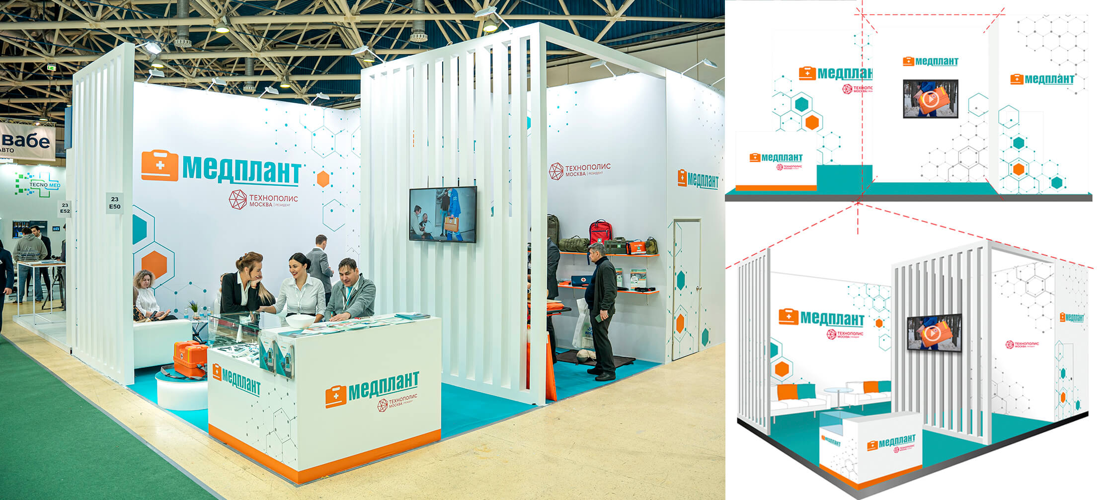
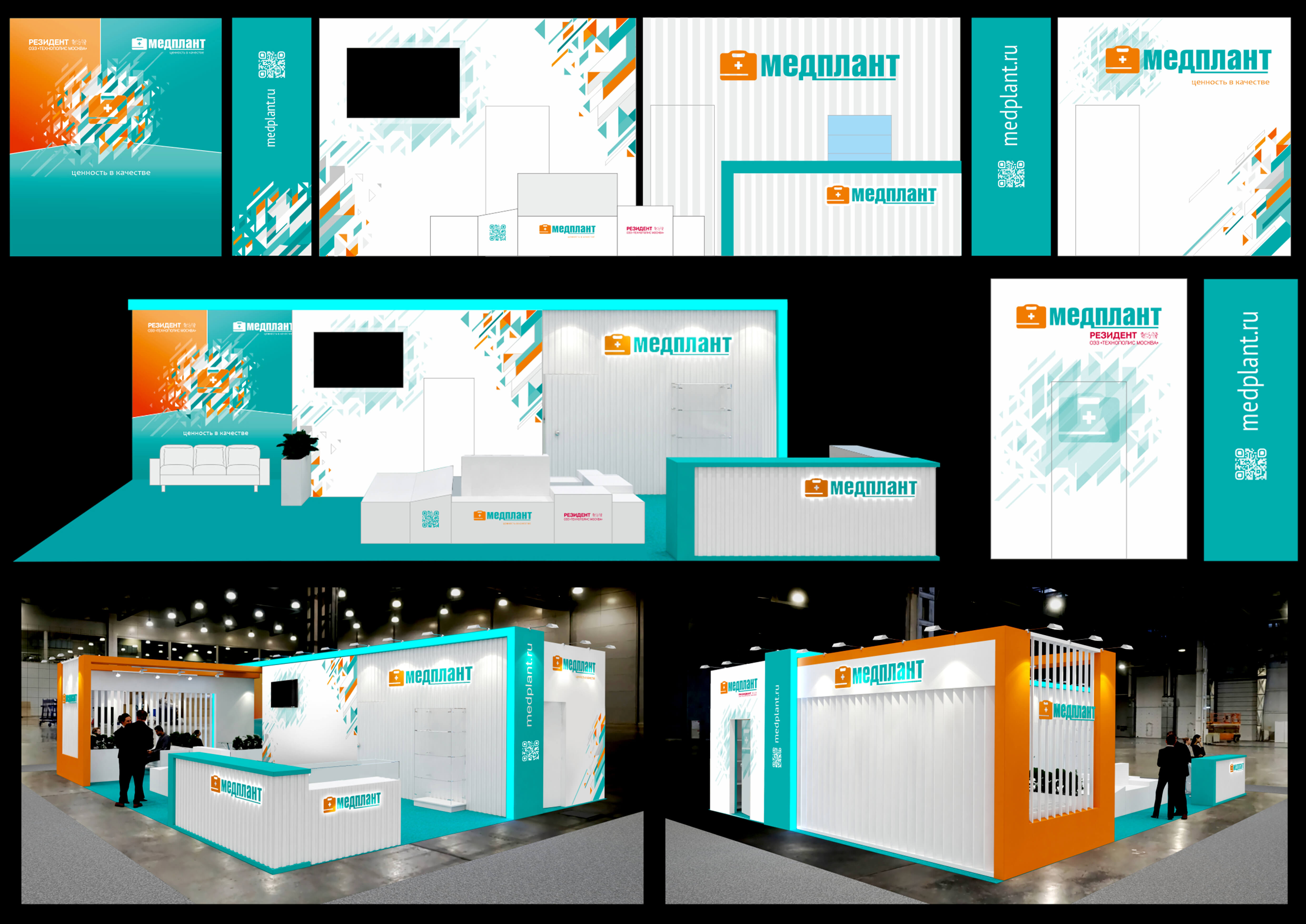
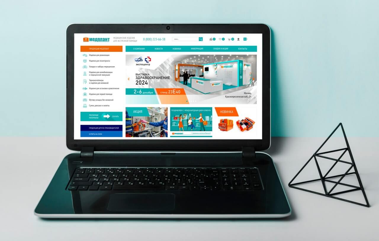
Task: redesign of the logo and all printed materials for a company specializing in the production and supply of medical products.
Features: the company's calling card is an orange doctor's emergency bag, developed by the company's engineers in the early 2000s. Thanks to this product, the company is well-known in Russia and neighboring countries among medical professionals and the general population. It is necessary to retain the graphic part of the logo in the form of the orange bag to maintain recognizability.
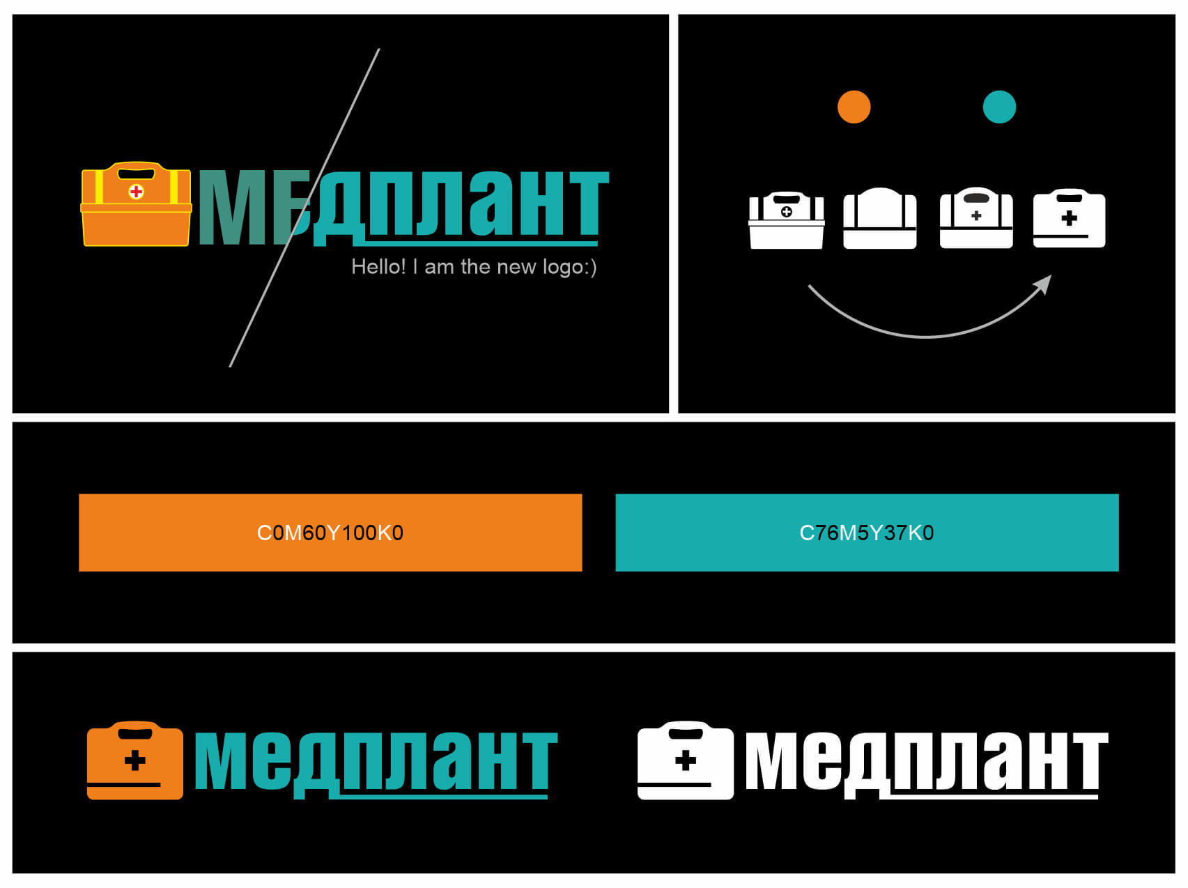
Solution:
- Simplification of the graphic part of the logo, elimination of excessive detail and outdated borders.
- Reduction of the number of brand colors to two, replacement of colors with brighter ones without changing the color direction.
- The font part is smoother compared to the original, maintaining continuity.
- Simple clear shapes are used in printed materials, gradients and shadows are omitted.
- More narrative photographs are used.
-
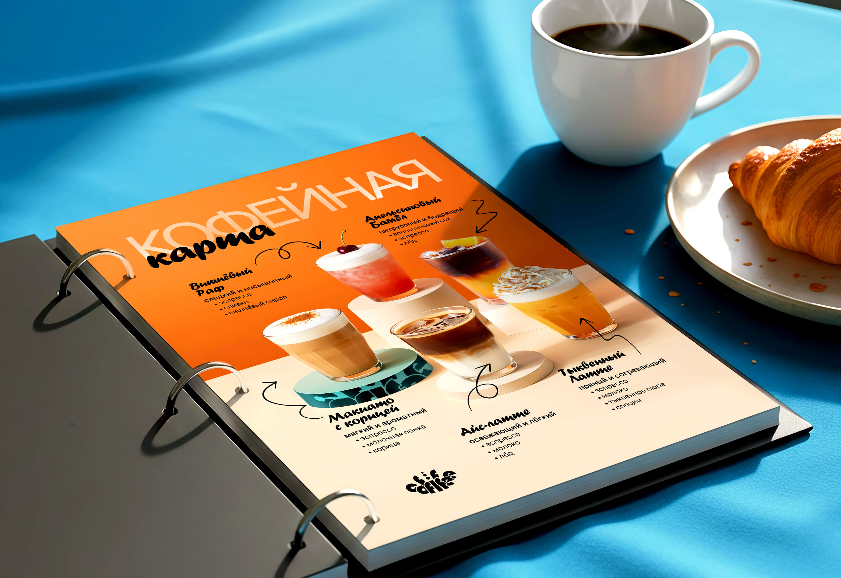
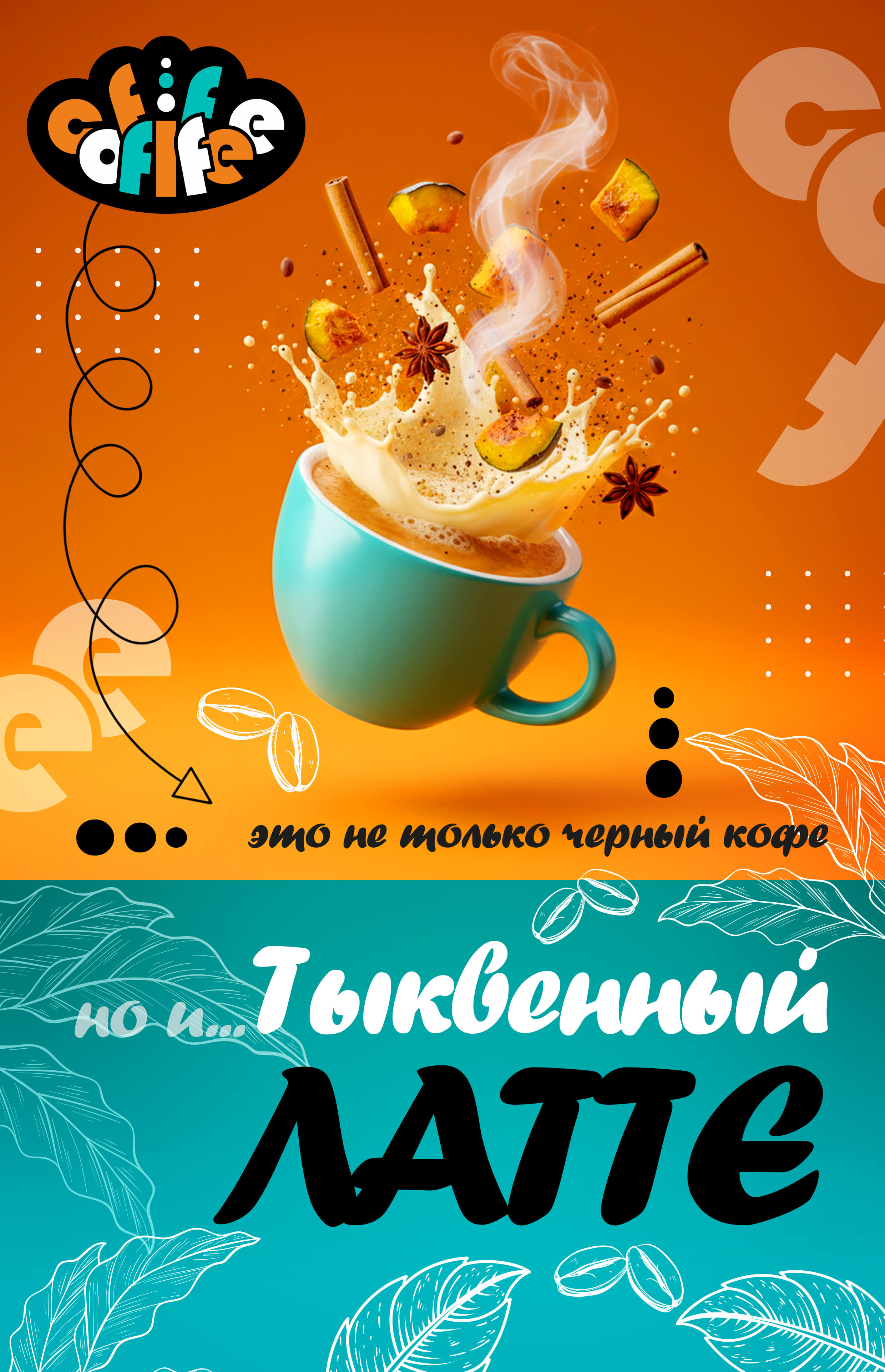
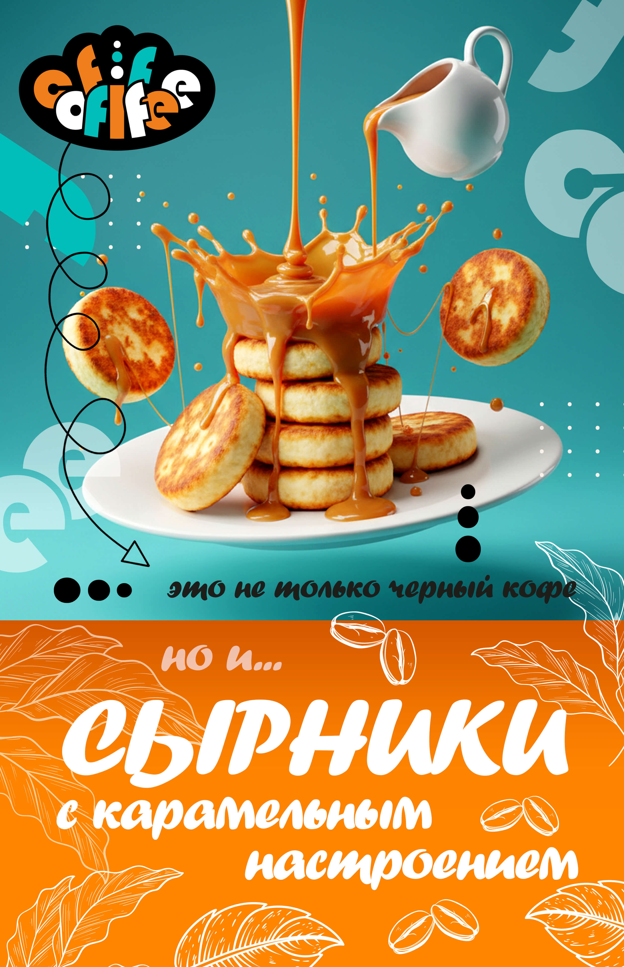
Coffiffee Café
Task: development of a brand identity for a café with a focus on signature drinks and unconventional flavor combinations.
Goal: to move away from the image of a traditional coffee shop and communicate the idea that coffee is not only about something "black and strict", but about a wide range of flavors and emotions. The goal was to attract an audience open to new gastronomic experiences.
Solution: the concept is built around the slogan: "Coffiffee is more than just black coffee". The identity is based on the idea of a "flavor explosion": in the logo, the letters appear to scatter apart, creating a dynamic and memorable visual effect. The brand colors — bright turquoise and orange — enhance the feeling of freshness, energy, and unexpected combinations. The visual style supports the idea of variety and can be easily adapted across menus, packaging, and promotional materials, emphasizing that the heart of the brand is experimentation and the joy of taste, rather than the classic formality of coffee culture.
-
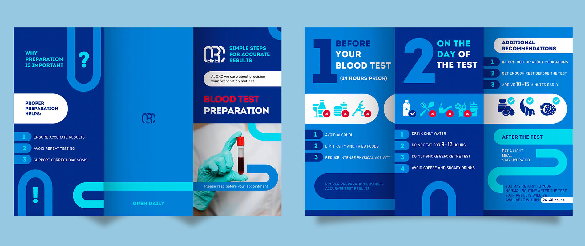
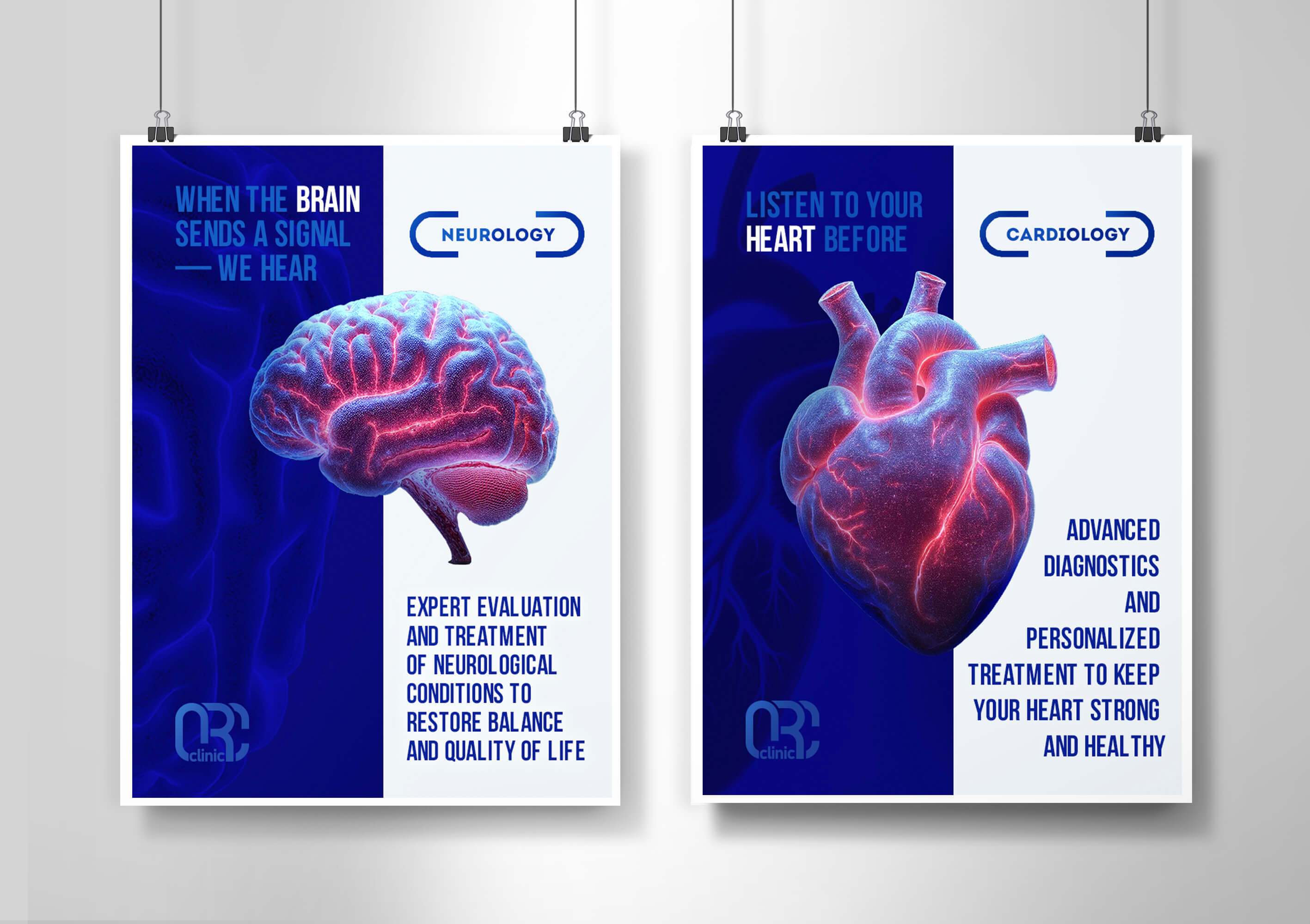
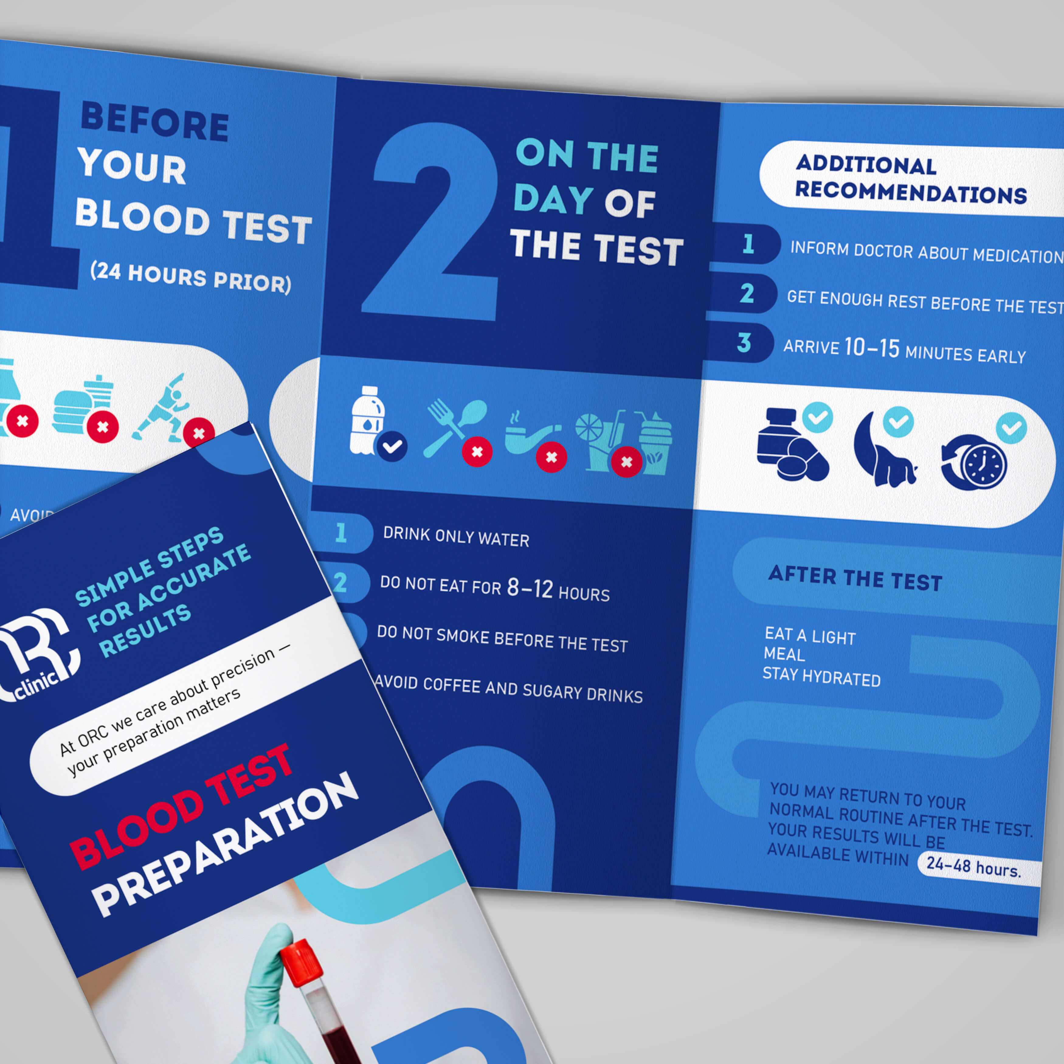
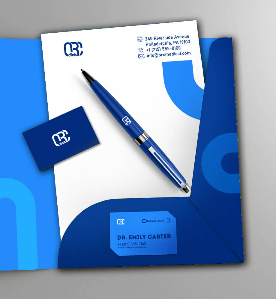
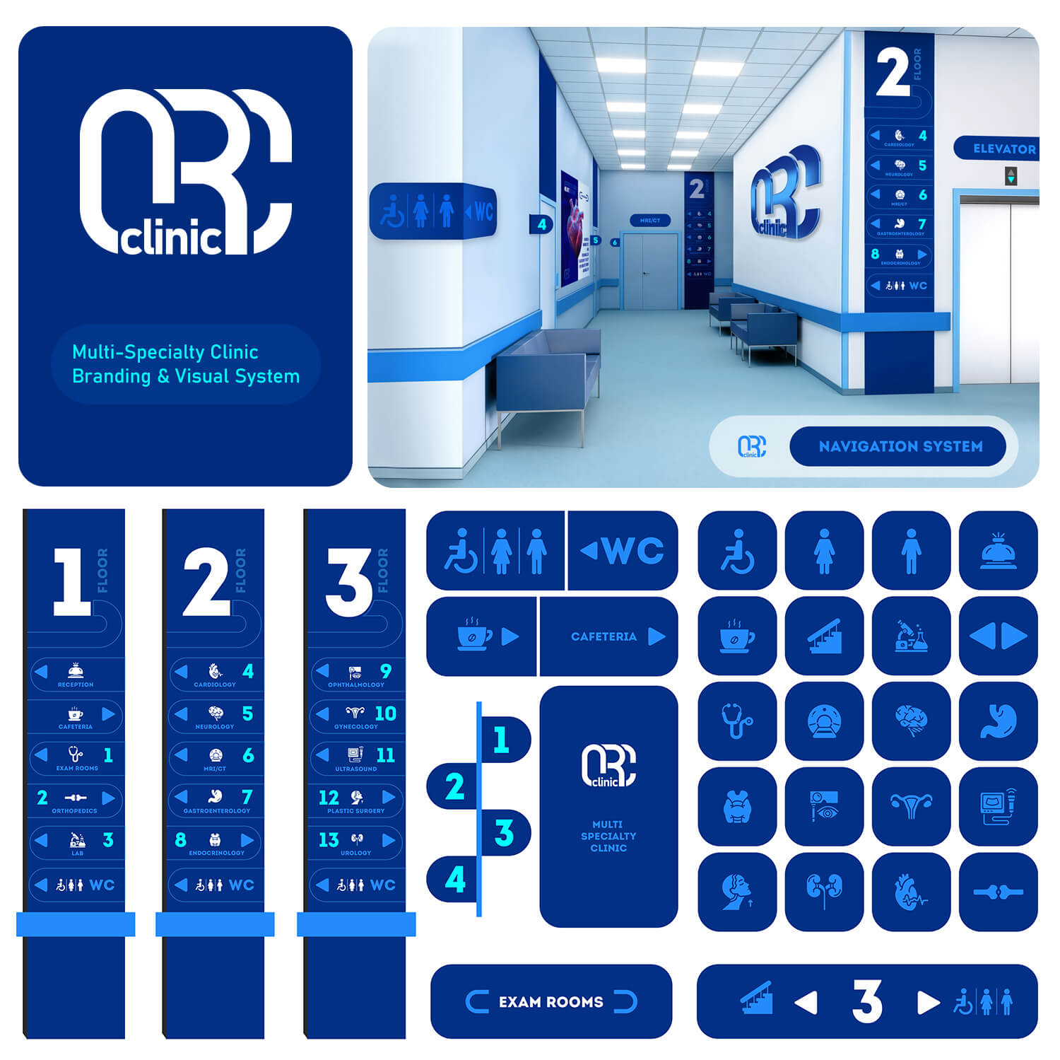
ORC Medical Clinic
Task: systematization of the existing brand: developing a navigation system and bringing the clinic’s visual materials into one consistent style.
Goal: to create a clear and comfortable environment for patients, and to increase trust through visual consistency and careful presentation of information.
Solution: a unified visual system was developed based on the existing logo. A navigation system for the clinic was created to help visitors move through the space more easily and reduce stress. The brand palette is built around deep blue and its shades, reinforcing a sense of reliability and professionalism. Templates were created for brochures, posters, and informational materials, with clear typography and structured layouts that make information easier to understand and ensure a consistent style across all patient touchpoints.
-
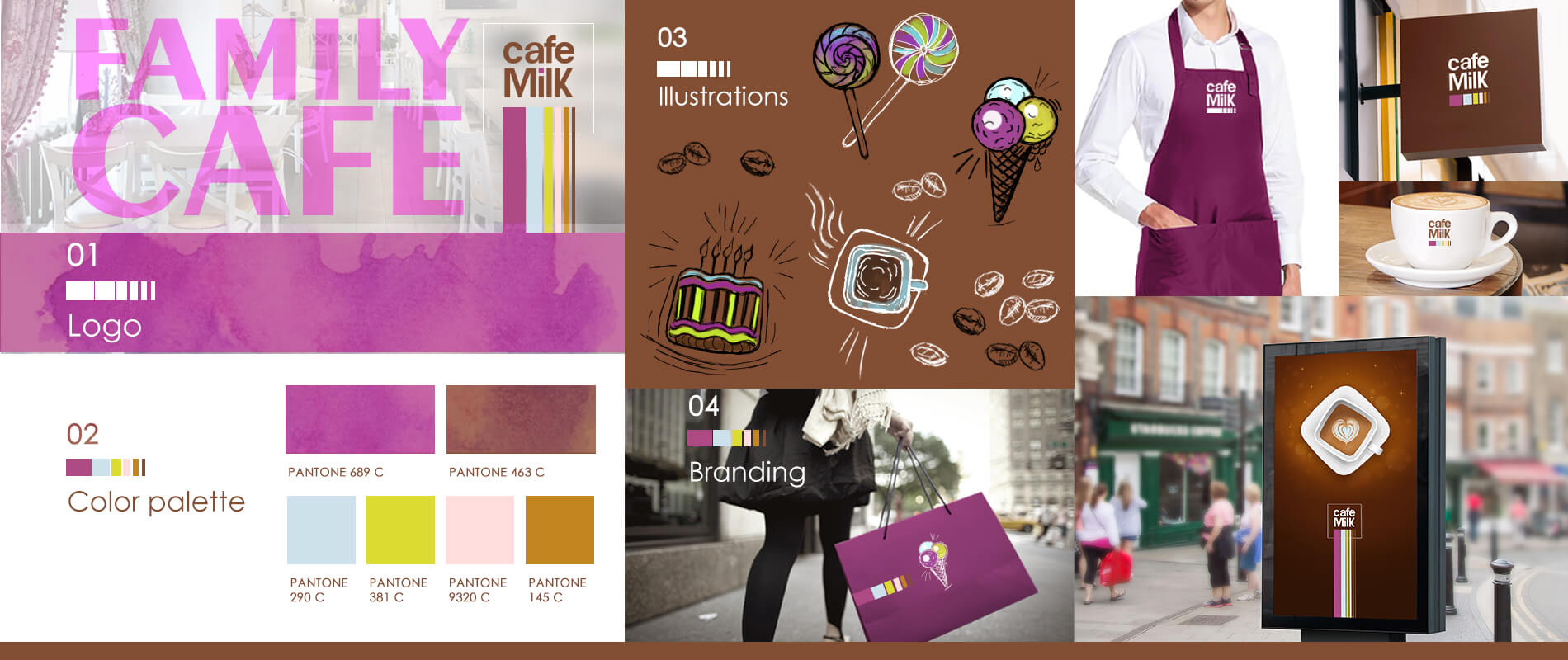
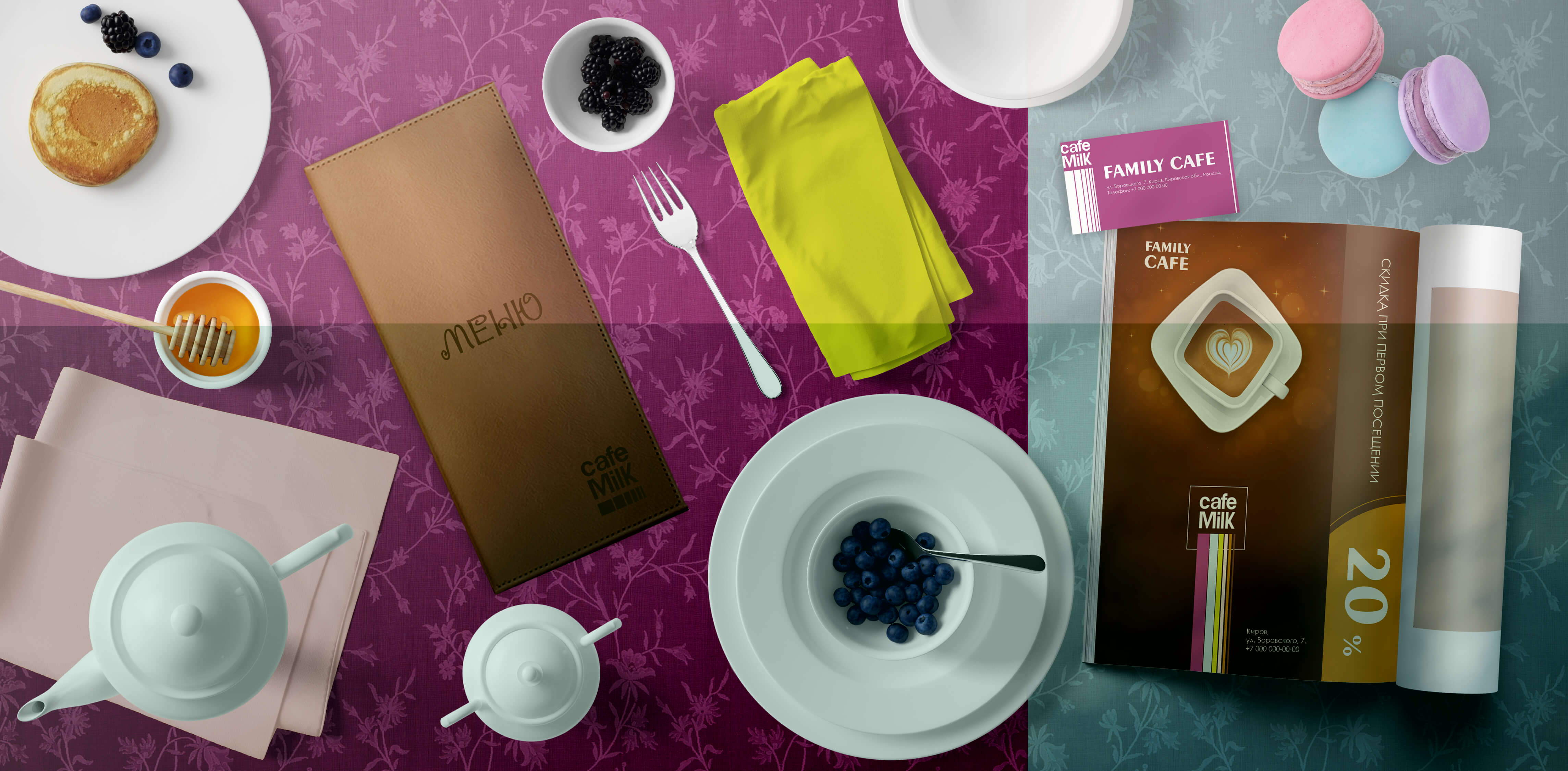
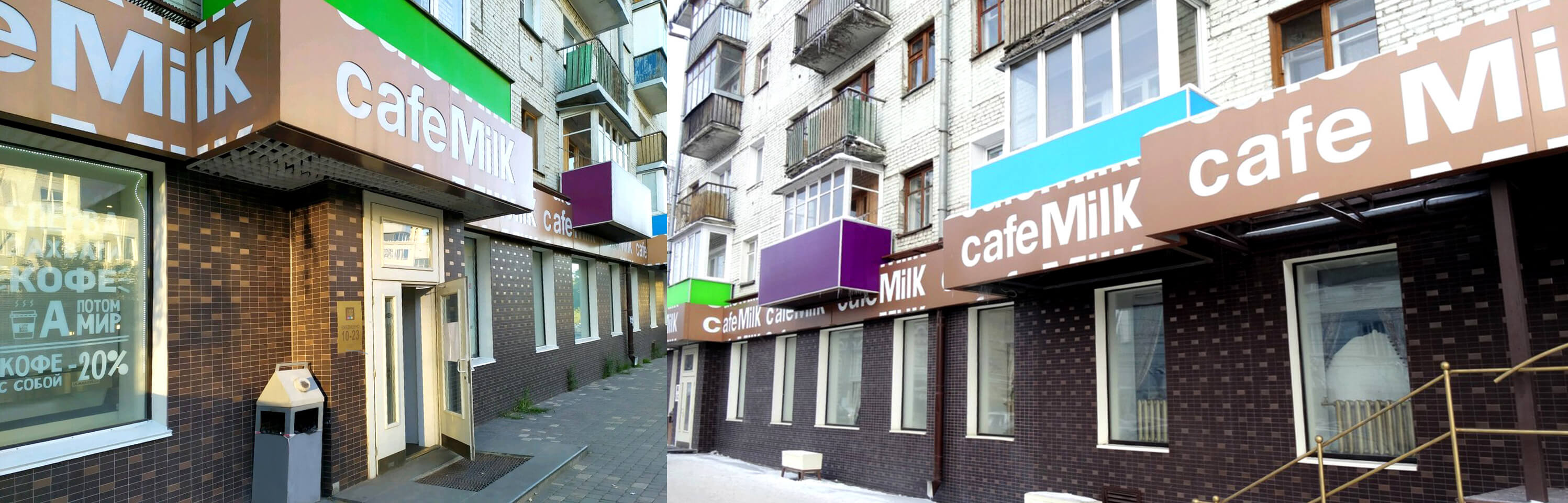
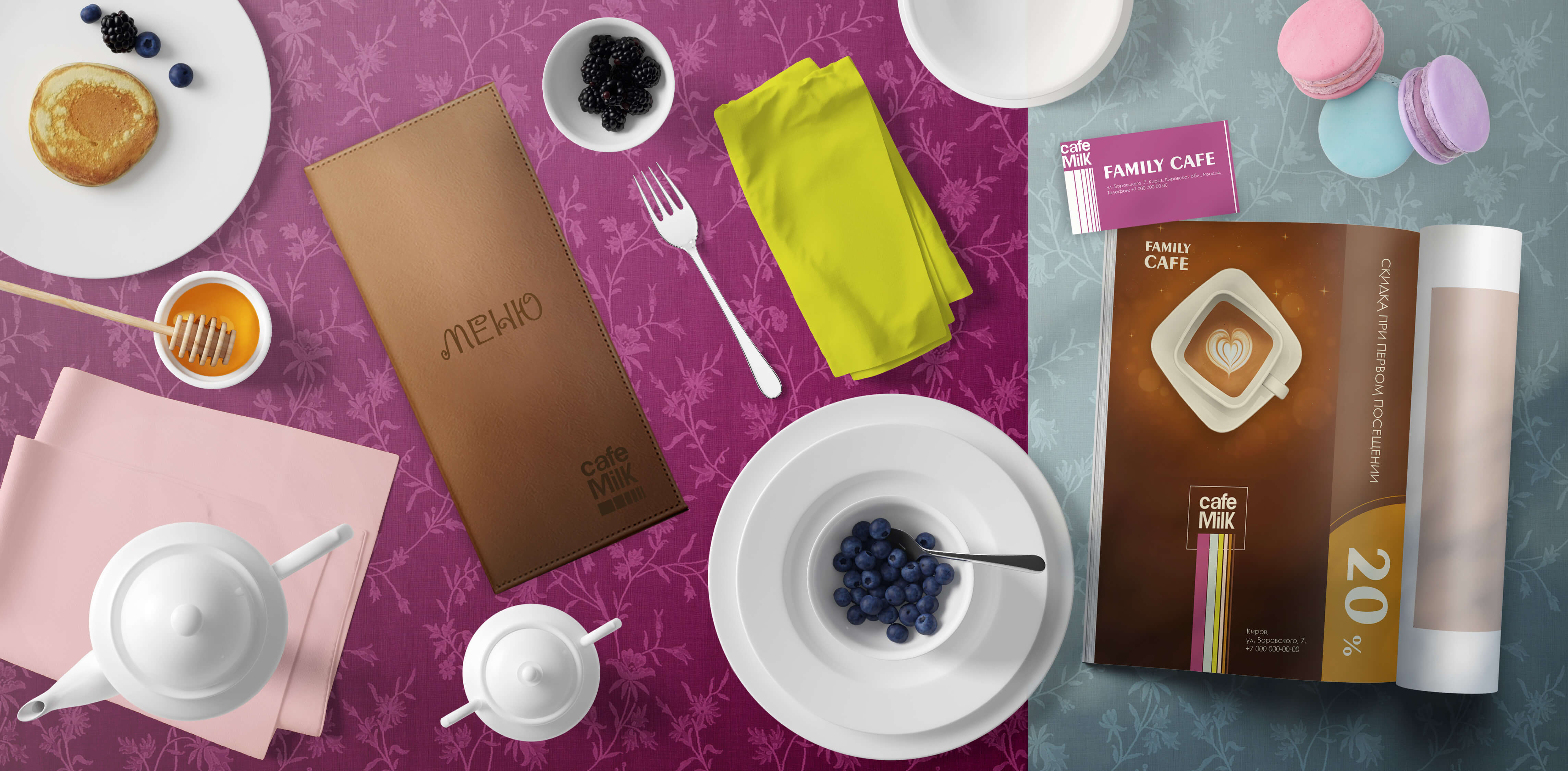
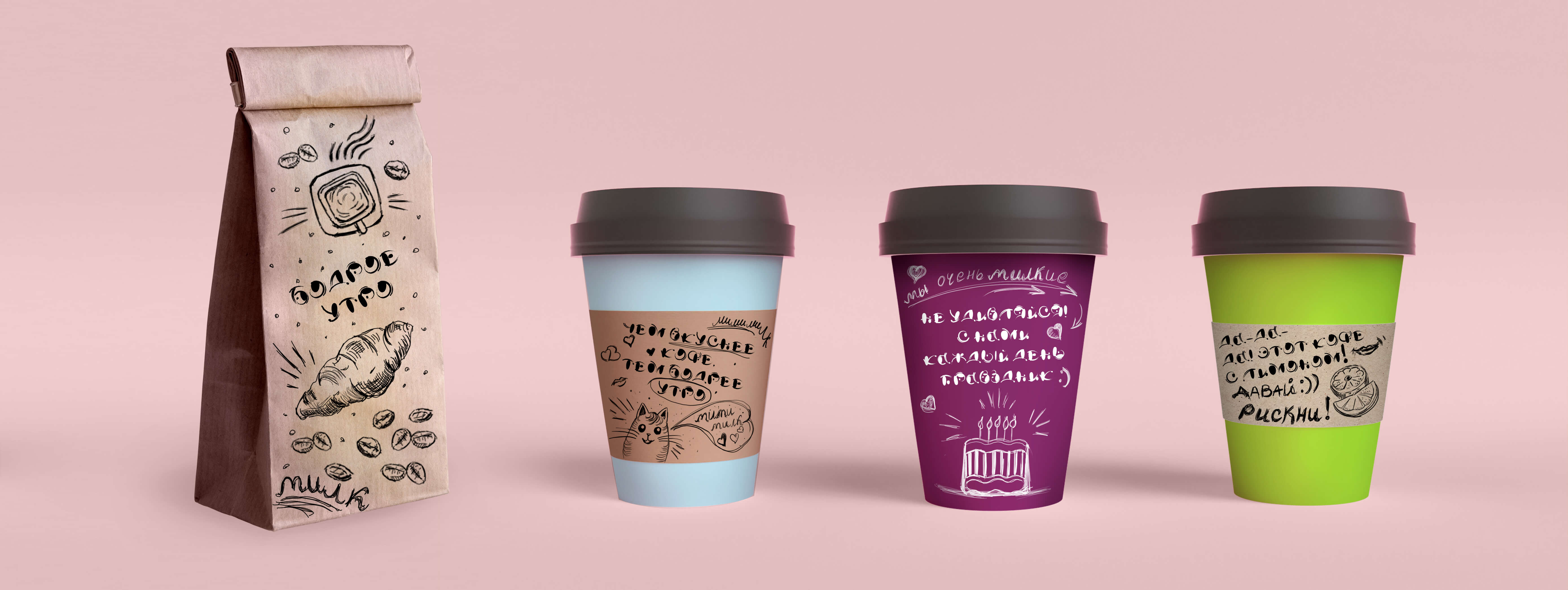
Cafe MILK
Task: turnkey design for a cafe with its own pastry shop.
Goal: visually engage city residents in the central part of Russia, where standard colors are gray and beige
Target audience: 2+ years old.
Solution: development of a vibrant logo, brand colors, and illustrations that will support the overall style, including the facade design of the building. The logo is designed as a multi-layered cake, and the brand colors are associated with sweets (chocolate, caramel, pistachios, ice cream, etc.). Illustrations are done in a careless style so that even a child can replicate them.